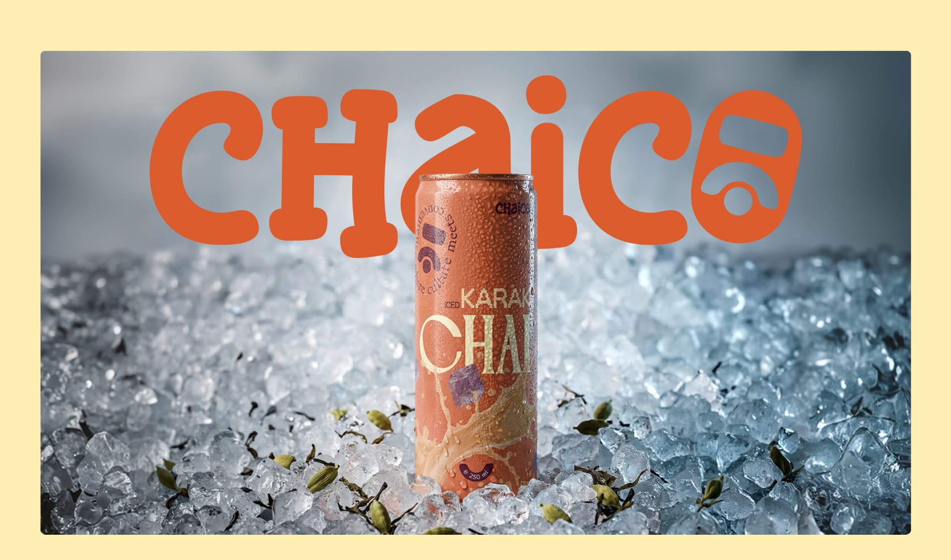
CHAICO
A Pakistani tradition, bottled for British streets. From cultural insight to a ready-to-drink brand built for UK retail grab-and-go fridges.
Timeline
2024
Category
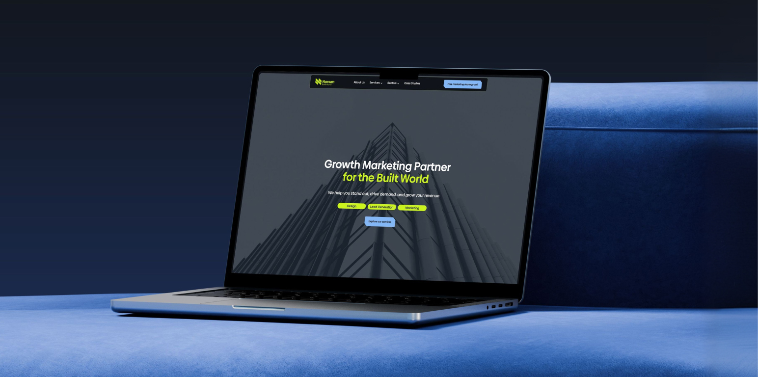
Brand & Web Design
My Role
Brand & Product Designer
Timeline
2024
Industry
F&B / Retail
Platform
Webflow
BRAND &
PRODUCT
DESIGNER
Most people think a designer makes things look good. That's the last 10% of the job.
A Brand & Product Designer starts earlier and goes deeper. I work at the intersection of two disciplines:
Brand Design is about how your business is perceived — your identity, your visual language, the signals your brand sends before a single word is read. It answers: "Why should I trust you?"
Product Design is about how your product works — the architecture of a website, the flow a user moves through, the decisions that make someone buy instead of leave. It answers: "Why should I buy from you?"
When both are designed together — which is rare — the brand builds the trust and the product converts it. That's what I do. Chaico is what it looks like when cultural insight meets design that sells.
Identity, visual language, cultural authenticity, and the warmth that makes chai feel like home.
Architecture, UX, conversion flow, and the decisions that get chai into UK fridges.
A brand that feels like home — and a website that sells it for you.
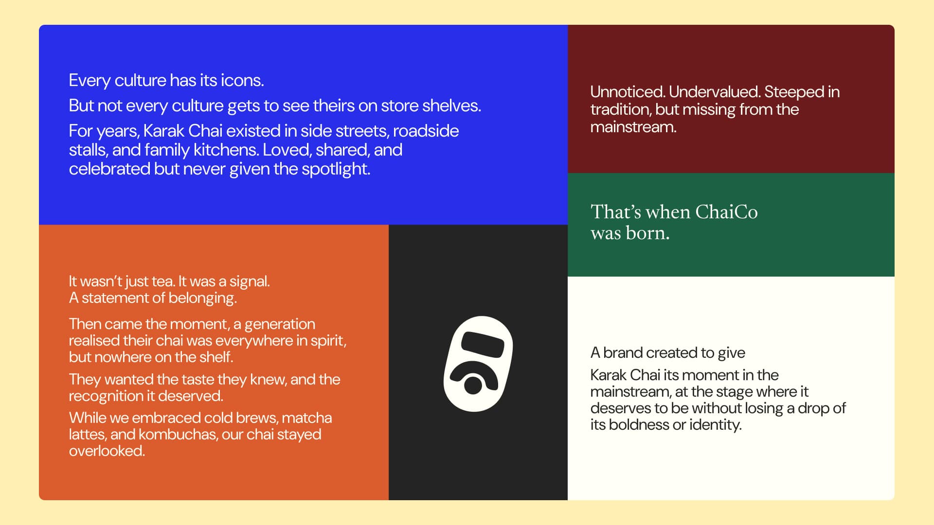
THE GAP IN
THE FRIDGE.
Every major UK supermarket and corner shop had shelves full of cold brew coffee in cans. Iced matcha. Canned cold coffee of every kind.
But chilled karak chai? Nothing.
One Pakistani entrepreneur living in the UK saw what the market missed: millions of South Asian, Middle Eastern, and chai-curious British consumers with no ready-to-drink option for the drink they actually love. The gap wasn't niche — it was enormous. And nobody had moved on it.
He had the product concept. He needed a brand and a website that could make a Pakistani tea tradition feel at home in a British grab-and-go fridge.
"THE GAP WASN'T NICHE. MILLIONS OF PEOPLE WANTED CHILLED KARAK CHAI — AND NOBODY WAS SELLING IT."
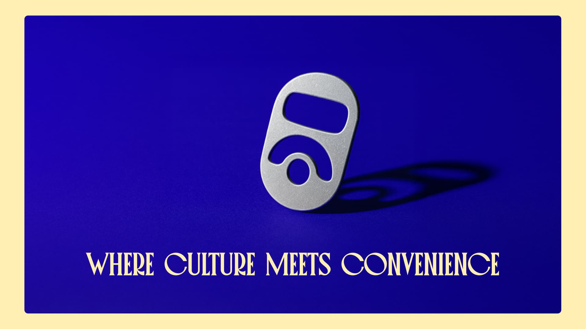
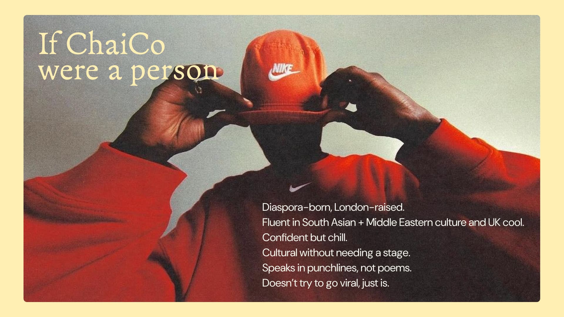
DESI SOUL.
BRITISH SHELF.
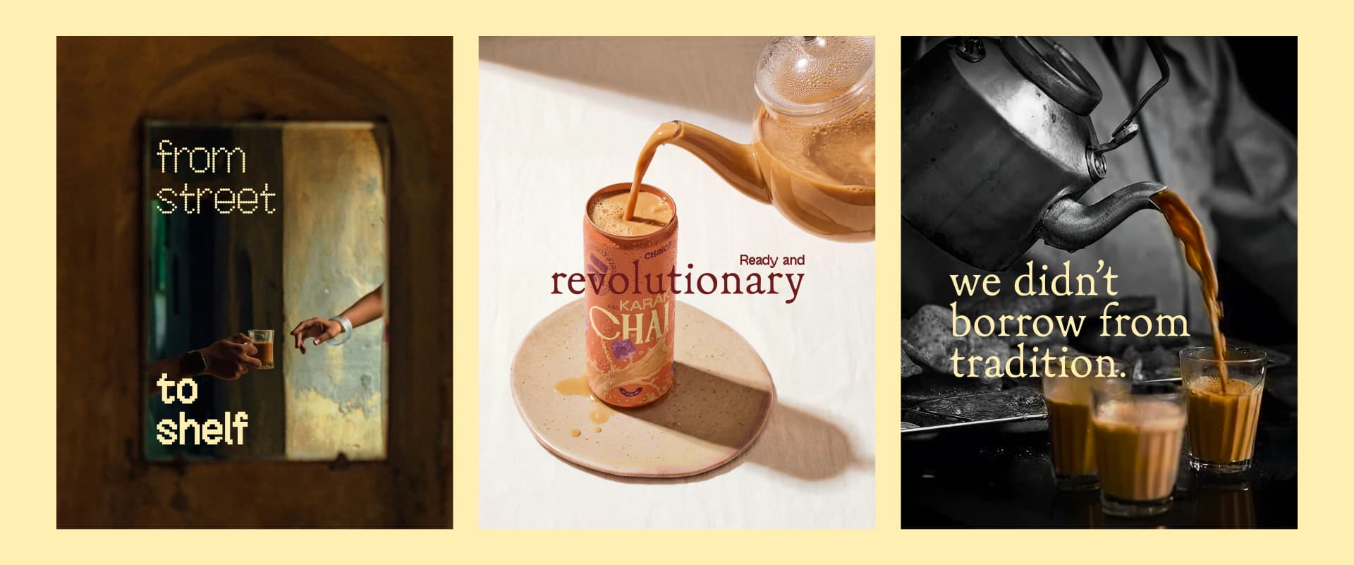
The first half of my job was brand design — building a visual identity that could do two things at once: feel culturally authentic to the South Asian community who know and love karak chai, and feel modern and confident enough to earn a spot next to oat milk lattes in a British convenience store. The brand couldn't look ethnic or niche. It needed to look like it belonged — while making its cultural roots its biggest selling point. That tension is where the design lives.
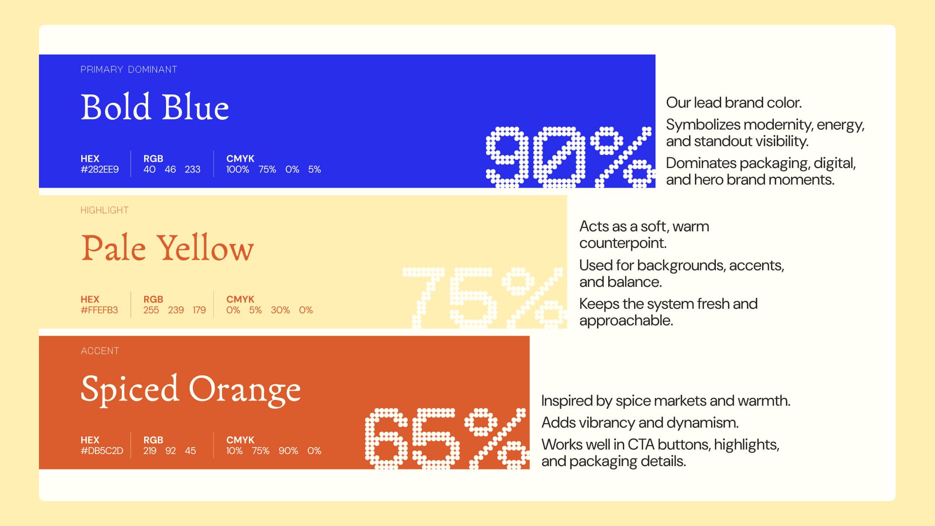
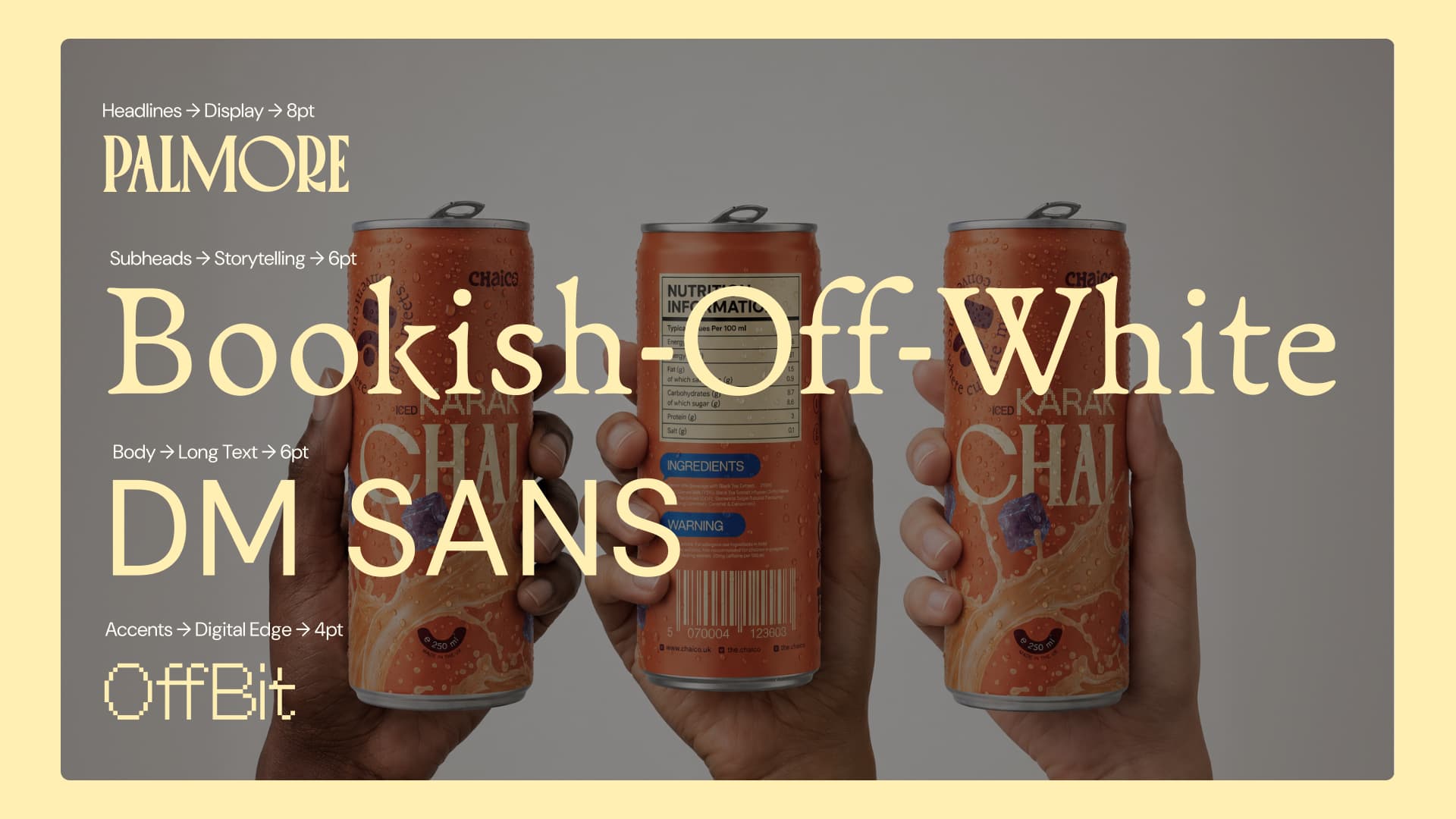
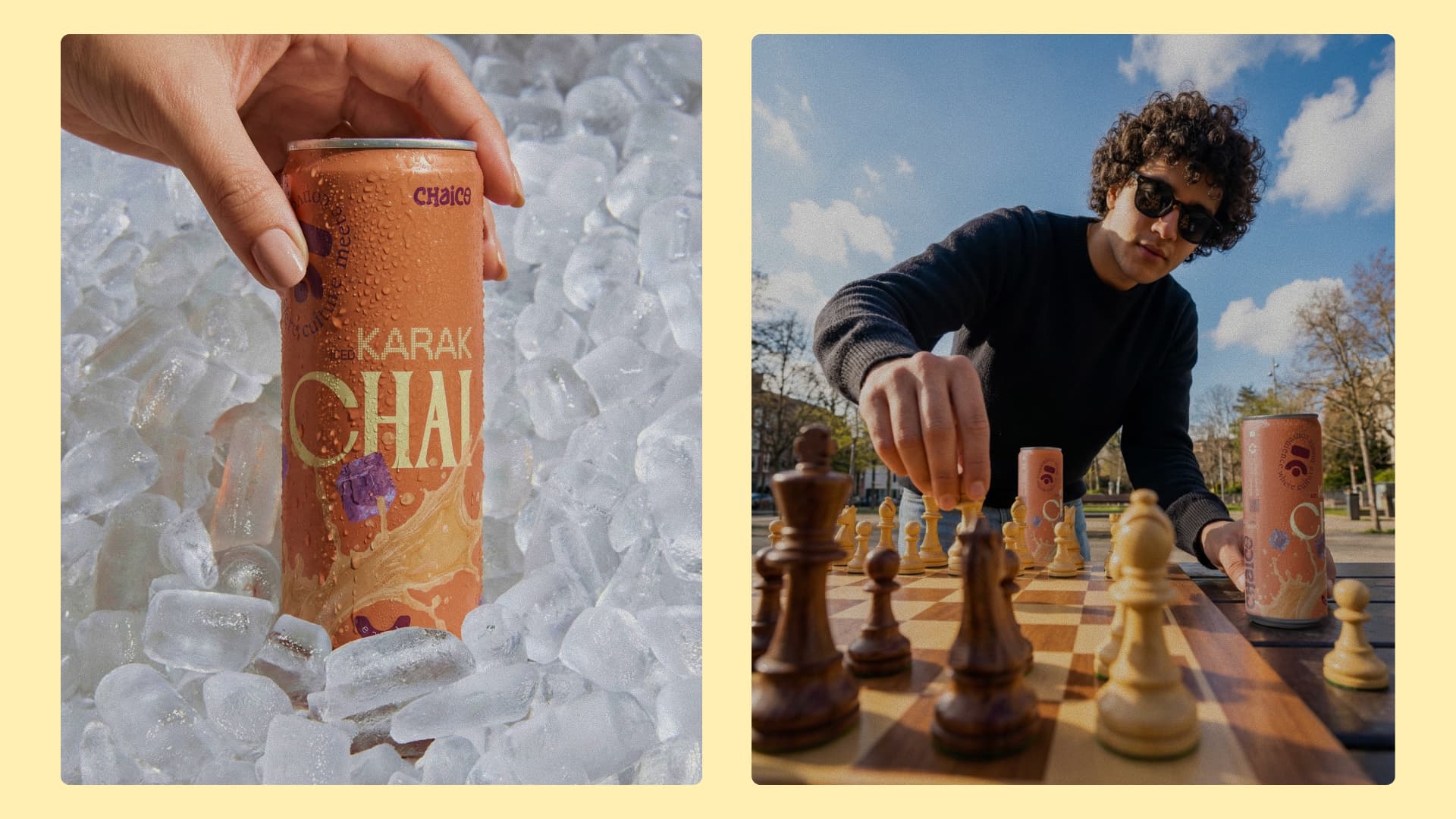
Warm, bold, and unapologetically chai. A visual identity that says 'this isn't a generic energy drink' before anyone reads a word.
Rich spice tones, strong typography, and visual cues that signal heat, tradition, and quality — not novelty.
Confident and approachable. Celebrates the culture without alienating anyone who's just discovering chai for the first time.
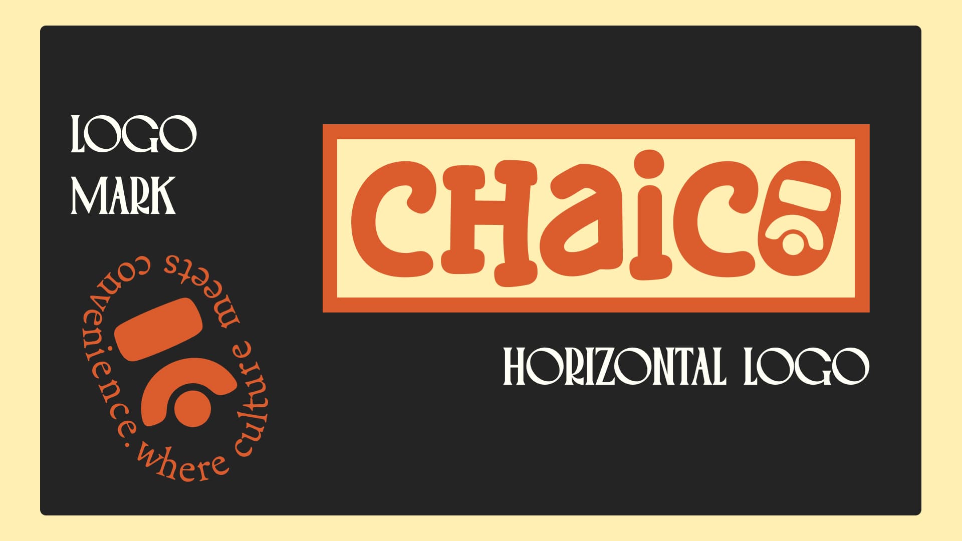
"Chaico" — simple, ownable, direct. Positions the brand as the category leader before the category even exists in the UK.
A WEBSITE BUILT
FOR TWO AUDIENCES.
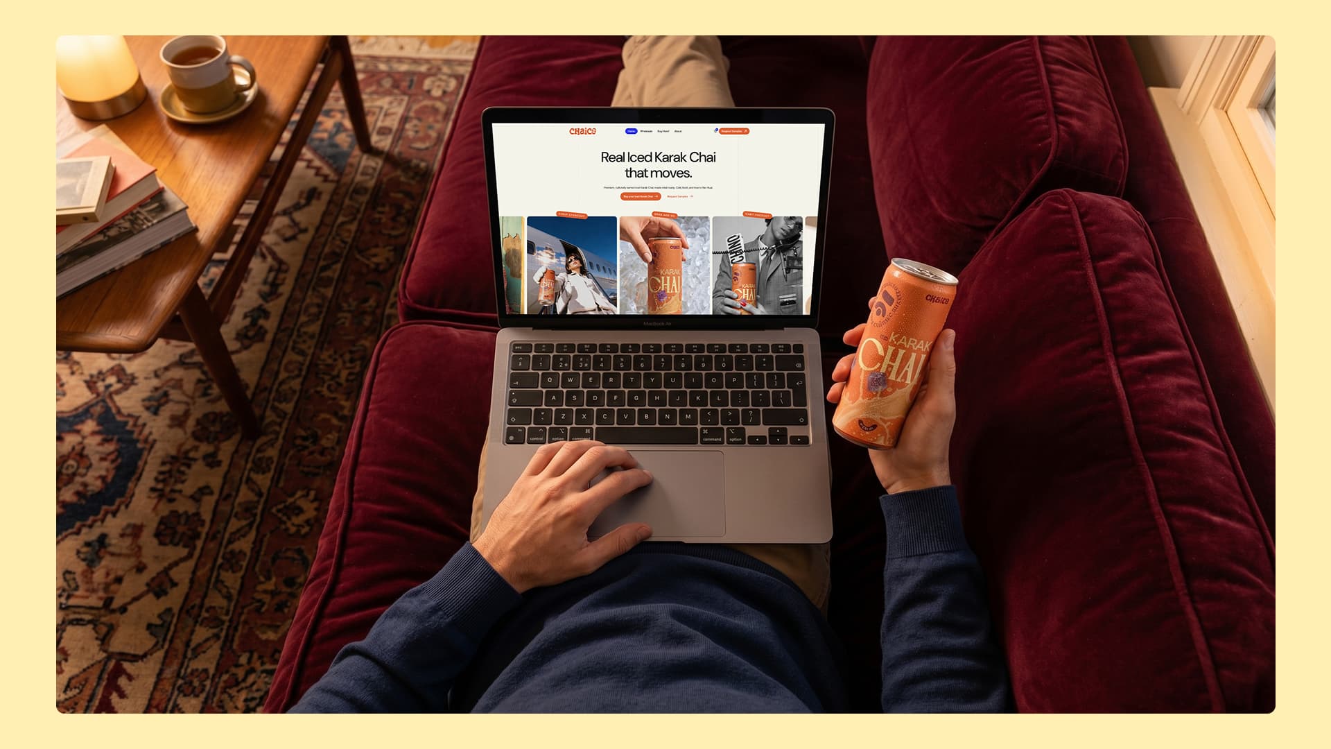
The second half of my job was designing and building the website on Webflow — and it had to speak to two very different people at the same time. The first is the consumer: someone who finds Chaico online or on social, wants to know what karak chai is, where to buy it, and whether it's worth trying. The second is the wholesale buyer: a retailer, a café owner, a distributor — someone deciding whether to stock it. They need credibility, volume information, and a reason to trust the brand at a commercial level. One website. Two conversion journeys. Both designed to close.
THE HOOK
Homepage opens on the product and the cultural story simultaneously — 'Real Iced Karak Chai.' The category and the differentiator in four words.
THE STORY
Who made it, why it exists, and what karak chai actually is. Educating new buyers without patronising those who already know and love it.
THE PRODUCT
The chai itself, front and centre — shot to look premium, cold, and craveable. Not ethnic. Not niche. Irresistible.
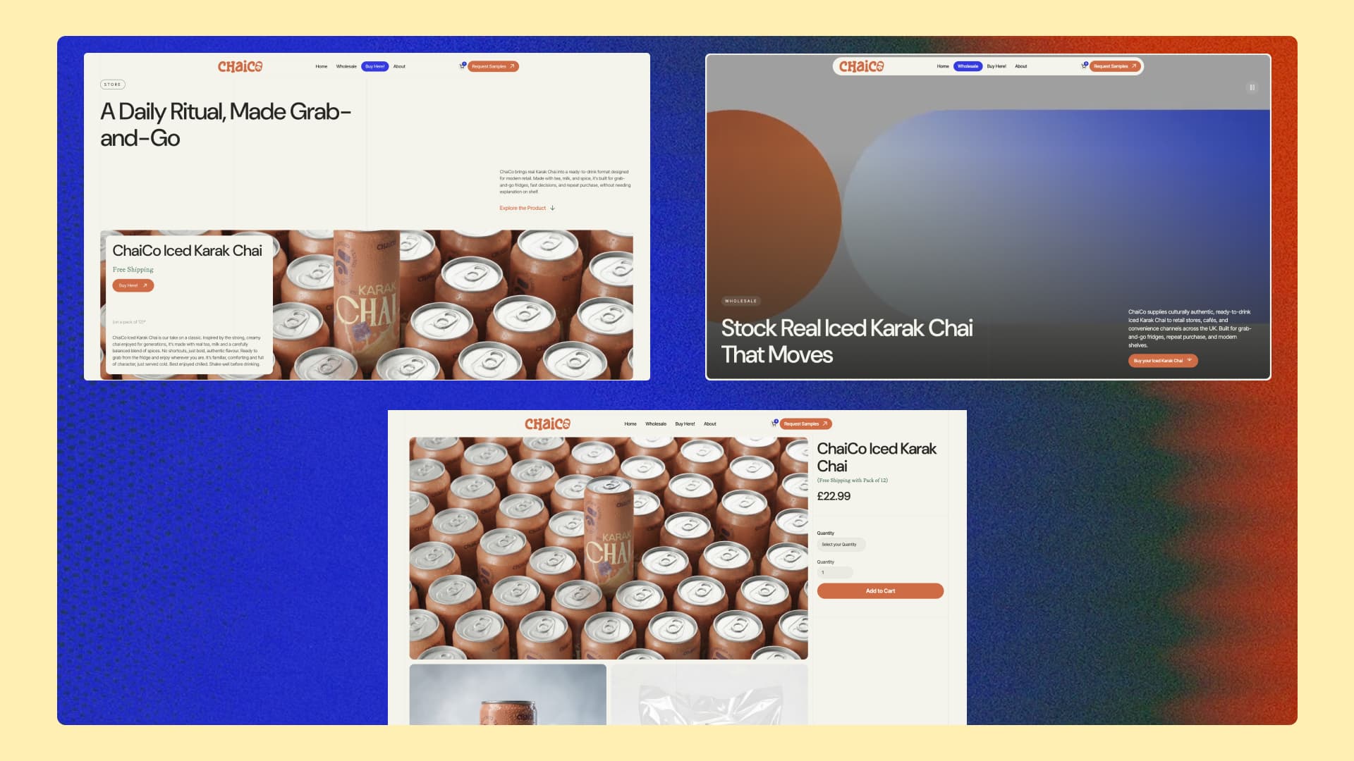
WHERE TO BUY
A clear retail locator so consumers can find the nearest stockist in seconds. Removes the biggest barrier between interest and purchase.
WHOLESALE CTA
A dedicated wholesale page targeting retailers and distributors with the commercial case for stocking Chaico — built for B2B conversion.
REPEAT PURCHASE
The full site architecture is designed to turn first-time discoverers into regular buyers and one-time stockists into long-term partners.
"Most designers hand off a logo and leave. Most developers get handed a brief and build what they're told. As a Brand & Product Designer, I did both — and because both came from the same strategic thinking, they're consistent in a way that's rare. The brand looks like the website. The website sells the brand. That coherence is the product."
AUTHENTICITY IS THE DIFFERENTIATOR
In a market full of brands chasing trends, Chaico's biggest advantage is that it's real. Real recipe. Real cultural roots. Real story behind it.
The brand design doesn't hide that — it makes it the entire point. In a British grab-and-go fridge, being genuinely from somewhere is more valuable than being generically 'premium.' That's the positioning, and the design executes it without apology.
DESIGNED TO GET ON SHELVES
A beautiful brand that doesn't sell to retailers never gets to sell to consumers. The wholesale page and B2B conversion journey were built with the buyer in mind — not the designer.
The language, the information hierarchy, and the credibility signals on the wholesale page are all there to answer the one question every buyer asks: 'Will this sell in my store?' The design answers yes before they finish reading.
A BRAND ISN'T A LOGO. IT'S THE REASON SOMEONE REACHES
FOR YOUR PRODUCT INSTEAD OF THE ONE NEXT TO IT.
Karak chai has been a staple in Pakistani and Middle Eastern homes for generations. What it needed was
a brand confident enough to bring it to British shelves — and a website smart enough to sell it when it got there.
- Logo & wordmark
- Color palette
- Typography system
- Visual language
- Cultural positioning guidelines
- Fully responsive
- Consumer journey
- Wholesale/B2B page
- Retail locator integration
- CMS for updates
Mohsin handled both brand and website — end-to-end, from first strategy call to live launch.